

Salam App
User interface design a social media creative for a new dating app

My Contribution
- UI Design
- Interaction Design
- Social Media
Tools Used
- Figma
- Photoshop
- Illustrator
- After Effects
Modern dating meets faithful commitment.
The Salam App set out to carve a distinctive space within the growing market of dating platforms for millennial Muslims. Its aim was to offer an experience that combined the polish and usability of leading apps with a sharper focus on cultural nuance, inclusivity, and a contemporary brand personality.
Rather than reinventing the wheel, the team wanted to refine it by building on established interaction patterns while tailoring the tone, aesthetics, and community experience to speak directly to their audience’s values and expectations. The challenge lay in balancing a sense of familiarity with a fresh identity that felt aspirational yet approachable.
This case study explores how I helped bring that vision to life, focusing on the craft of the user interface and the subtle UX details that shaped an experience designed for connection, authenticity, and cultural relevance.
The Challenge
When I joined the project, the core user flow and information architecture had already been mapped-out by the team. This meant my role leaned less on shaping the structural UX and more on elevating the experience through thoughtful, visually engaging interface design. I approached the challenge by translating the predefined journey into clear, intuitive layouts and building a cohesive design system that could scale as new features were introduced.
My focus was to craft a UI that felt effortless to navigate yet full of character, reflecting the brand’s personality at every touchpoint. I worked across typography, iconography, colour palettes, and motion principles, refining details like spacing, hierarchy, and micro-interactions so that each screen felt polished and purposeful. By balancing familiarity with subtle cultural cues, I aimed to give users a sense of comfort and belonging while maintaining the sleek, contemporary standards people expect from today’s most popular dating platforms.


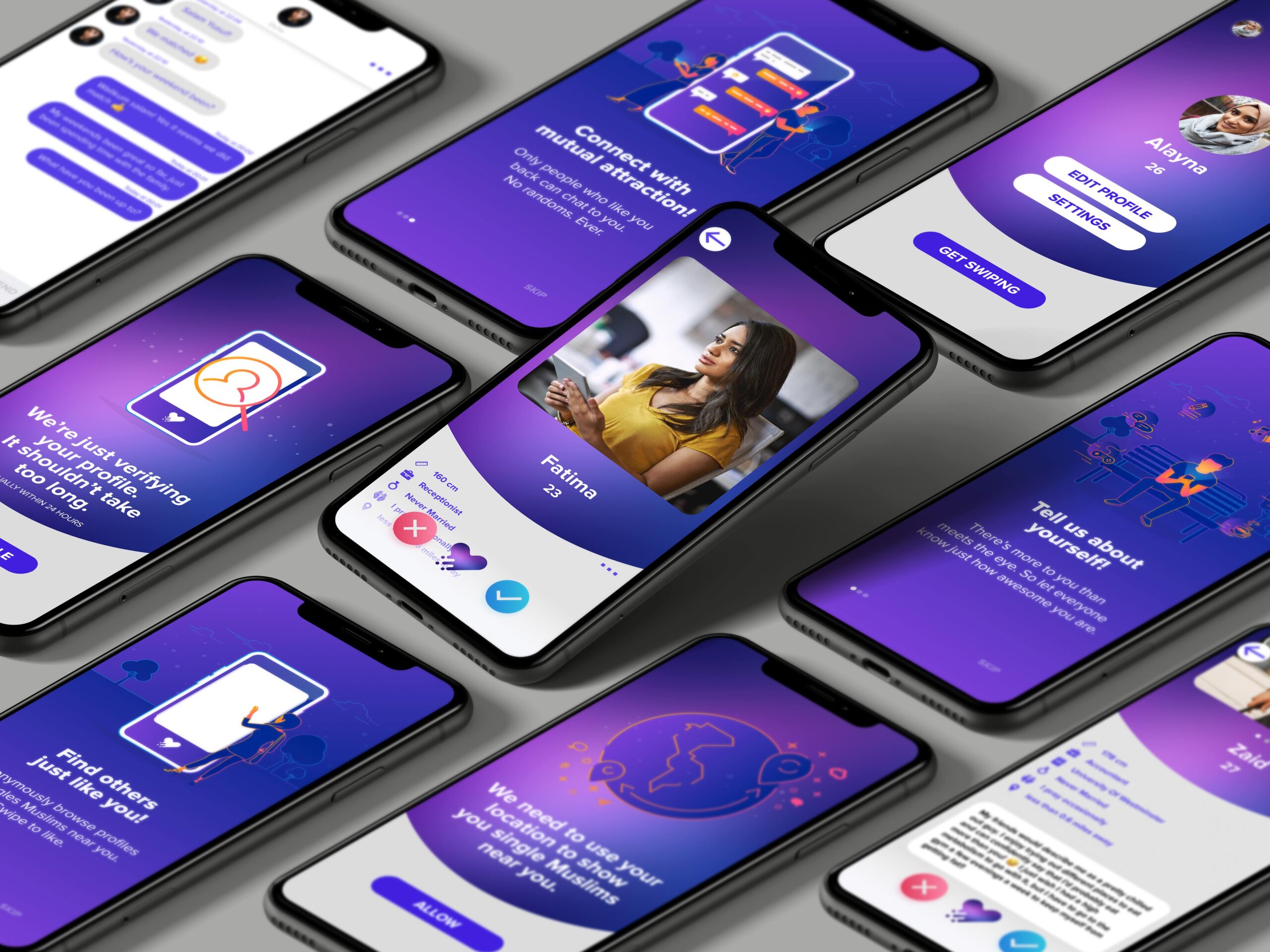
Onboarding
For the onboarding flow, I designed screens that aimed to quickly engage new users and encourage them to complete the setup journey. I focused on keeping the content concise and visually appealing, using bold headlines and simple illustrations to communicate value at a glance.
To make the process feel seamless, I limited cognitive load by breaking the information into three digestible steps and used clear progress indicators to show users how close they were to getting started. Each screen highlighted a core benefit of the app, creating a custom experience, finding meaningful connections, and tailoring matches to personal preferences, all framed in a positive and inviting tone. This combination of persuasive messaging, approachable visuals, and guided structure was designed to build trust and motivate users to complete the onboarding experience.
With additional time, I would have developed Lottie animations from the existing illustrations to bring more motion and personality to the screens. This would have added a layer of dynamism and enhanced the overall user experience, making the interface feel more engaging and responsive.
Celebrating Swipes
When approaching the core interaction of expressing interest, I started by examining user expectations within the dating app space. Swiping has become the de facto standard because it is fast, tactile, and carries a playful sense of momentum, so it made sense why the team decided to adopt this familiar mechanic as the primary mode of interaction. However, I also considered accessibility and user inclusivity: not everyone finds swiping intuitive, especially people who prefer more precise interactions or those with swipe-fatigue. To address this, I introduced a set of action buttons along the bottom of the screen, offering a tap-based alternative. This dual approach allowed the app to feel both modern and familiar while reducing friction for a wider audience.
For the matching moment, my focus was on creating a sense of emotional payoff. A mutual “like” is a pivotal milestone in the user journey, so it needed to feel significant and gratifying. I explored different ways to deliver this feedback and landed on a celebratory confetti animation, which adds energy and positivity without overwhelming the interface. The intent was to trigger a small moment of delight, reinforcing the value of the app and motivating users to keep engaging with it. By framing each successful match as an achievement, the design encourages users to either take the next step in starting a conversation or to continue exploring, helping to sustain long-term engagement.
Given more scope for user testing, I would have explored alternative feedback mechanisms beyond visuals, such as incorporating audio cues or haptic vibrations. These could have activated additional senses to enhance the user experience, but they also carried the risk of overwhelming users. Proper testing would have been essential to evaluate their effectiveness, however, due to time and project constraints conducting this research was not possible within the current scope.
Persuasive Posts
The primary platform for pushing the brand and promoting the app was social media, where competition for attention is high and content needs to be both visually engaging and easy to consume. I was asked to develop a cohesive design language that could be applied across both text-based and image-led posts, ensuring the brand felt consistent regardless of format. To achieve this, I created a flexible visual system built around clear typography, bold colour use, and adaptable layout templates, so that posts would stand out in busy feeds while still maintaining brand recognition.
A key consideration was also the client’s ability to manage their own content. I therefore designed the system with simplicity in mind, providing templates and guidelines that allowed the client to produce regular updates without needing specialist design skills, while still retaining a polished, professional look.


