

Black Friday
A 360 promotional campaign delivered multinationally for Travelex, a leading international money exchange bureau.
My Contribution
- Branding
- Motion Graphics
- Social Media
- Print Design
Tools Used
- After Effects
- Cinema 4D
- Illustrator
- Photoshop
That time of the year when you can get a discount on anything. Even money!
Over the last few years, Black Friday has grown to become the biggest single day of discounts and sales for retailers. Travelex wanted to capture the excitement around this critical holiday sales season to increase their revenue and presence in the tourism space.
I was tasked with designing one of the first unified campaigns that Travelex planned to roll out across Europe. The design had to translate to multiple mediums, localities and languages, while also standing out in a saturated promotional period. The challenge was made even more difficult as I was restricted to a tight deadline and was the sole designer working on the project.
Art Direction
As we had access to over 350 digital screens at retail locations all over Europe, as well as being able to use videos online, I suggested we take an animation led approach. After aligning on this with the marketing team, I got to work on the storyboard and art direction.
The video starts off with large balloon letters floating up to clearly indicate the viewer is about to be presented with a Black Friday promotion. The “pop” then draws more attention to the creative as the headline copy abruptly changes to the localised messaging. Finally the Travelex logo is presented in a fun way to reinforce the enjoyable nature of the video, to leave a positive impression in the viewers mind. Where necessary, the logo was also to be used as a transition to loop the video.


Breaking Rules
I chose this specific colour combination, knowingly breaking away from the core Travelex colour palette of using red, white and dark blue. At first it raised a few eyebrows, but after I explained my reasoning, the team were fully behind it. Yellow, because it has psychological connotations with “fun” (which is a feeling we tried to invoke within the storyboard), in addition to black as it has enough contrast from the primary colour and is mentioned in the title. There is a sense of balance in these colours which helped to sell the concept and it opened the door to pushing the boundaries in future designs.
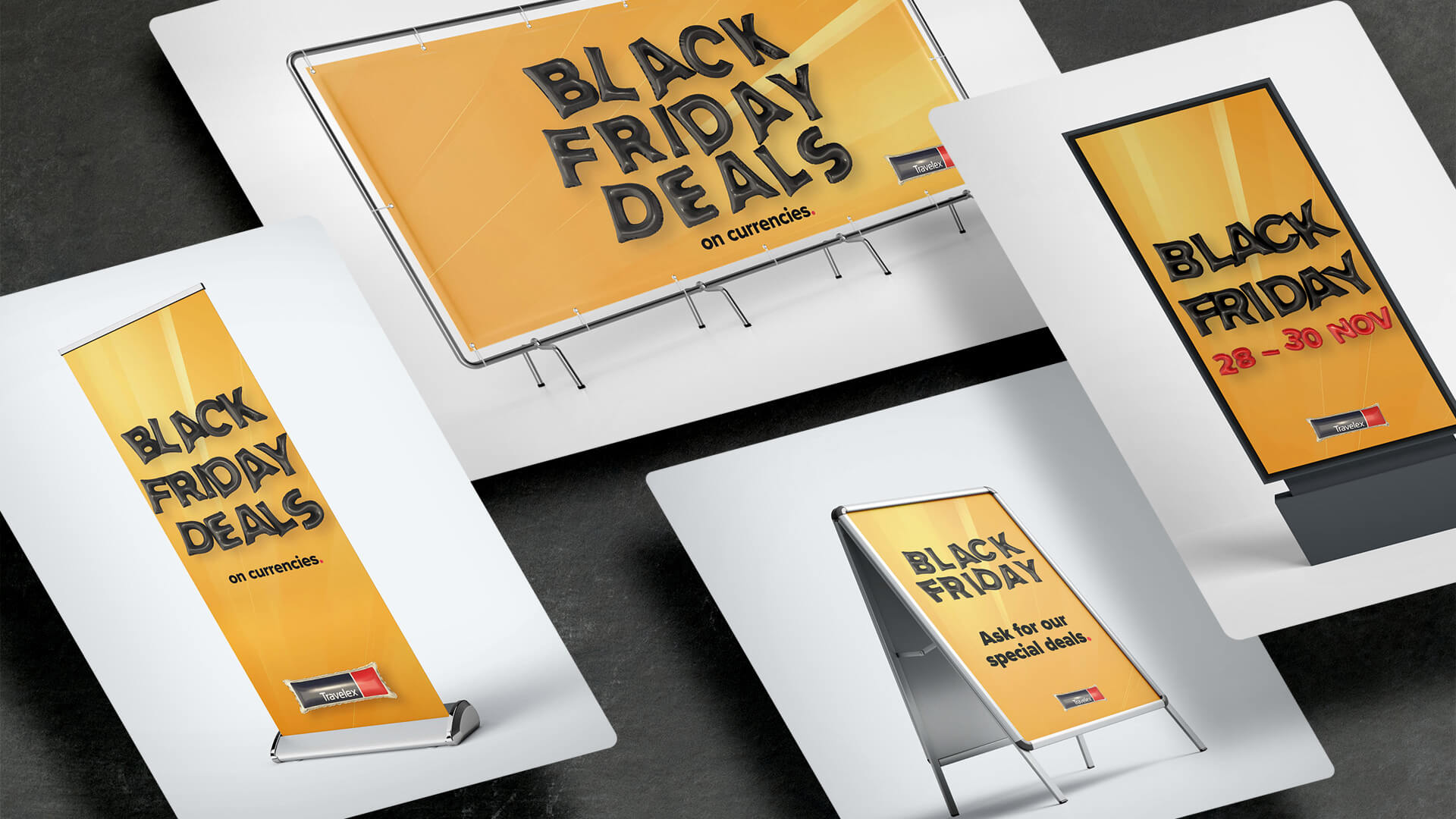
Translating Success
The final design had to be localised to 4 different languages and a variety of different dimensions, mediums and messages. The campaign was well received from the marketing department from each geolocation, further cementing the desire to create more unified campaigns going forward. Global sales grew around 11% compared to the previous year’s Black Friday campaign, and feedback received from retail colleagues about interest generated from the creative was very positive. Ideally we could have had a more tangible way to measure the increase in brand awareness.


