

Squiddle
User interface design for a fintech brand
My Contribution
- UI Design
- Interaction Design
Year
- 2023
Tools Used
- Figma
- Illustrator
Financial support at your fingertips.
Squiddle was conceived as a spin-off brand under the Finular group to serve a growing segment of customers in the short-term lending market. While its sister brand, Fund Ourselves, focused on peer-to-peer lending, Squiddle set out to offer slightly larger loans to a lower-risk audience, backed exclusively by private equity funding.
As an early-stage start-up, the project offered an exciting opportunity to help shape the visual language of a new financial product. Partnering closely with the Head of Brand, I worked to translate the positioning of Squiddle into an interface that balanced credibility and accessibility. Every design decision, from colour and typography to micro-interactions, was guided by the need to create a product that felt modern, transparent, and trustworthy within an often-crowded sector.
The Challenge
Developing Squiddle’s user experience came with unique constraints. To reduce build time and costs, the platform needed to adopt Finular’s existing back-end technology, meaning that its core information architecture and several functional patterns were already set. On top of that, the design could not deviate too far from layouts used across the group’s other brands, while remaining compliant with the Financial Conduct Authority’s strict customer care guidelines.
Our task was to work creatively within these boundaries to define a design language that felt fresh and distinctive without compromising usability, regulatory standards, or the technical requirements inherited from existing products. The challenge became an exercise in subtle innovation, introducing thoughtful touches and polished visuals that gave Squiddle its own personality while preserving operational efficiency.
Design System
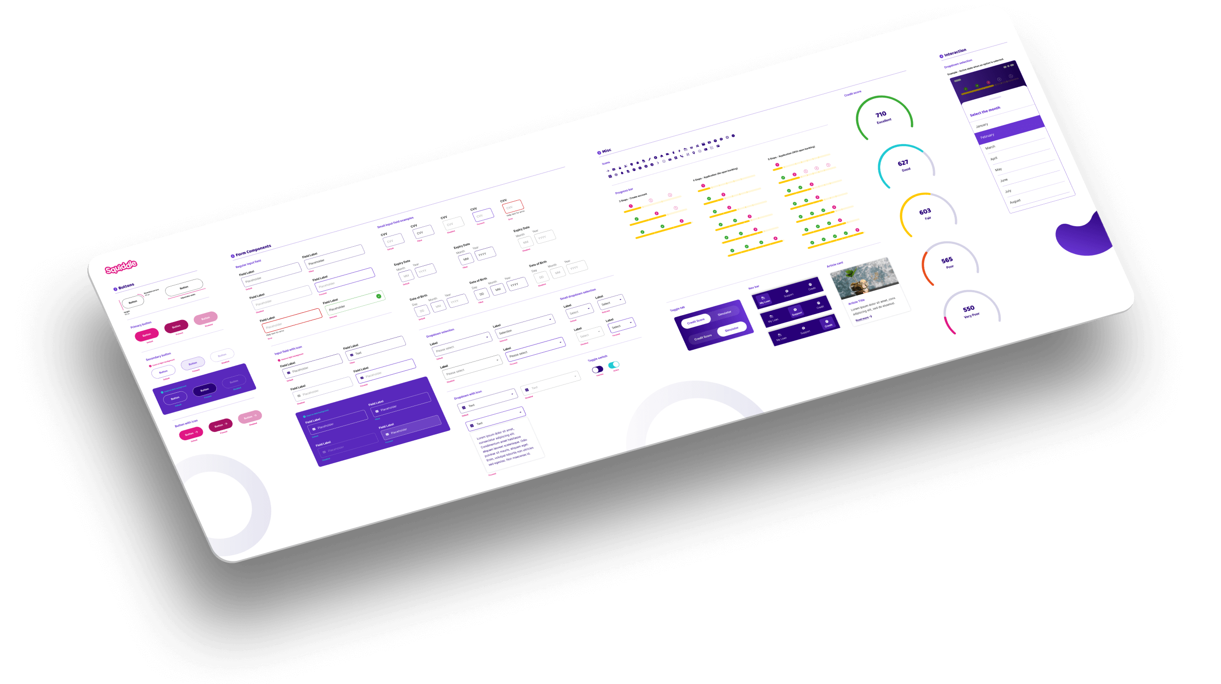
From the outset, we recognised that Squiddle needed a flexible design system that could stand apart in the short-term lending space while remaining scalable as new features emerged. We built a component library in Figma that paired clean, contemporary styling with a reassuring tone. Buttons, form fields, cards, and navigation elements were crafted to promote clarity and ease of use, while colour palettes and typography embedded the brand’s lively yet professional character at every interaction.
The system served as more than a toolkit for UI components, it became a shared language between designers, developers, and the marketing team. By documenting usage patterns, spacing rules, and accessibility standards, we ensured the brand’s personality remained consistent, whether in the smallest icon or the most data-heavy page.
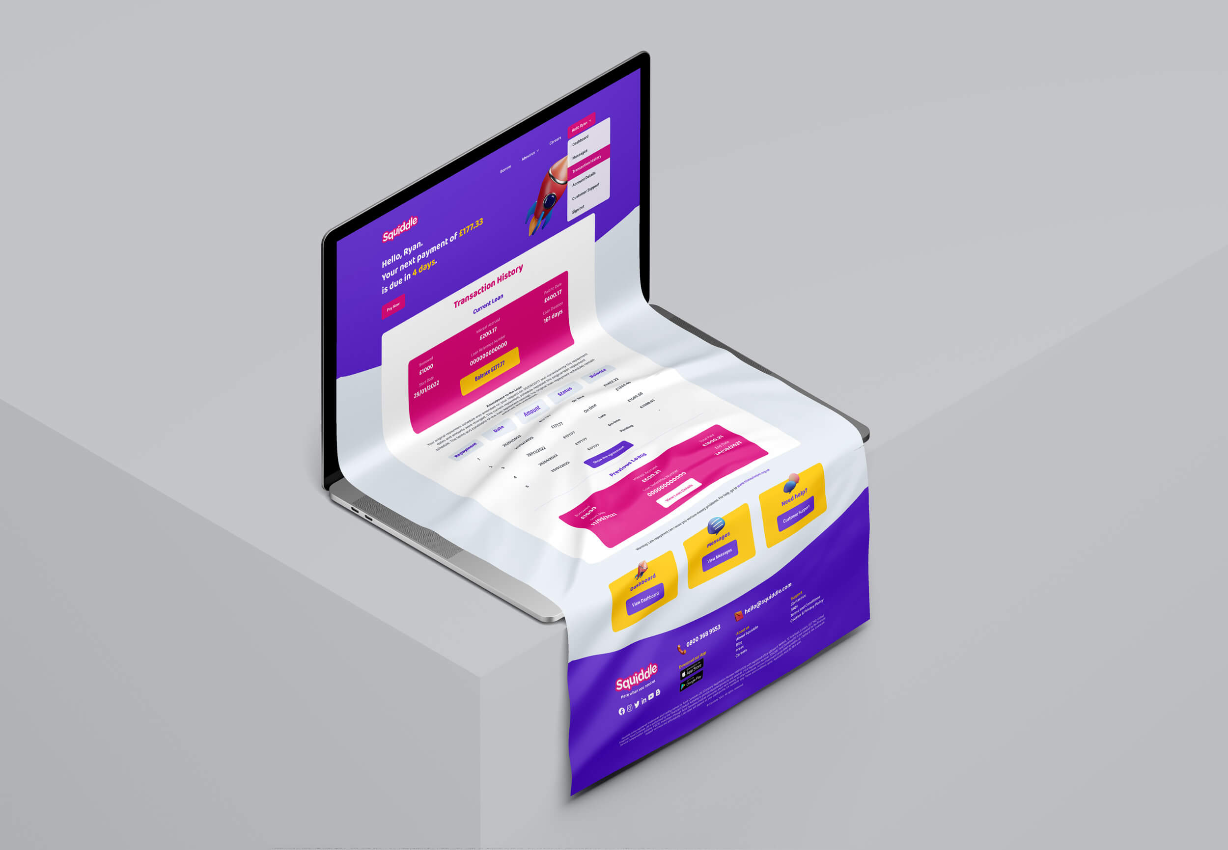
Website
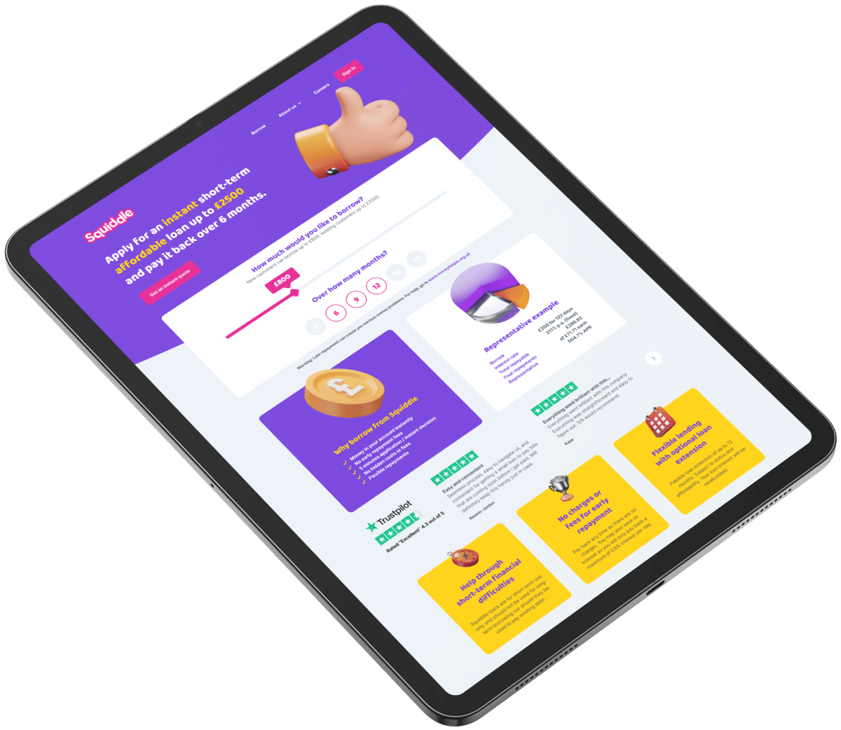
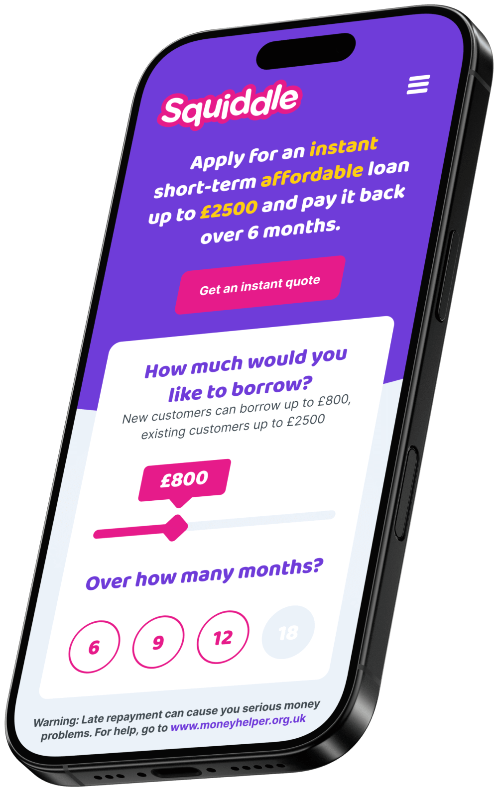
Designing Squiddle’s website meant striking a balance between respecting the platform’s inherited information architecture and giving it a visual identity strong enough to stand out. We approached the layout with a meticulous eye, refining page hierarchies, content spacing, and interaction patterns to deliver a streamlined borrowing journey.
Where possible, we pushed beyond the boundaries used by sister brands, introducing bolder typography, playful iconography, and subtle motion to create an interface that felt confident yet friendly. The result was a responsive web experience that adapted seamlessly across breakpoints while clearly positioning Squiddle as a modern, user-centric alternative in the lending market.
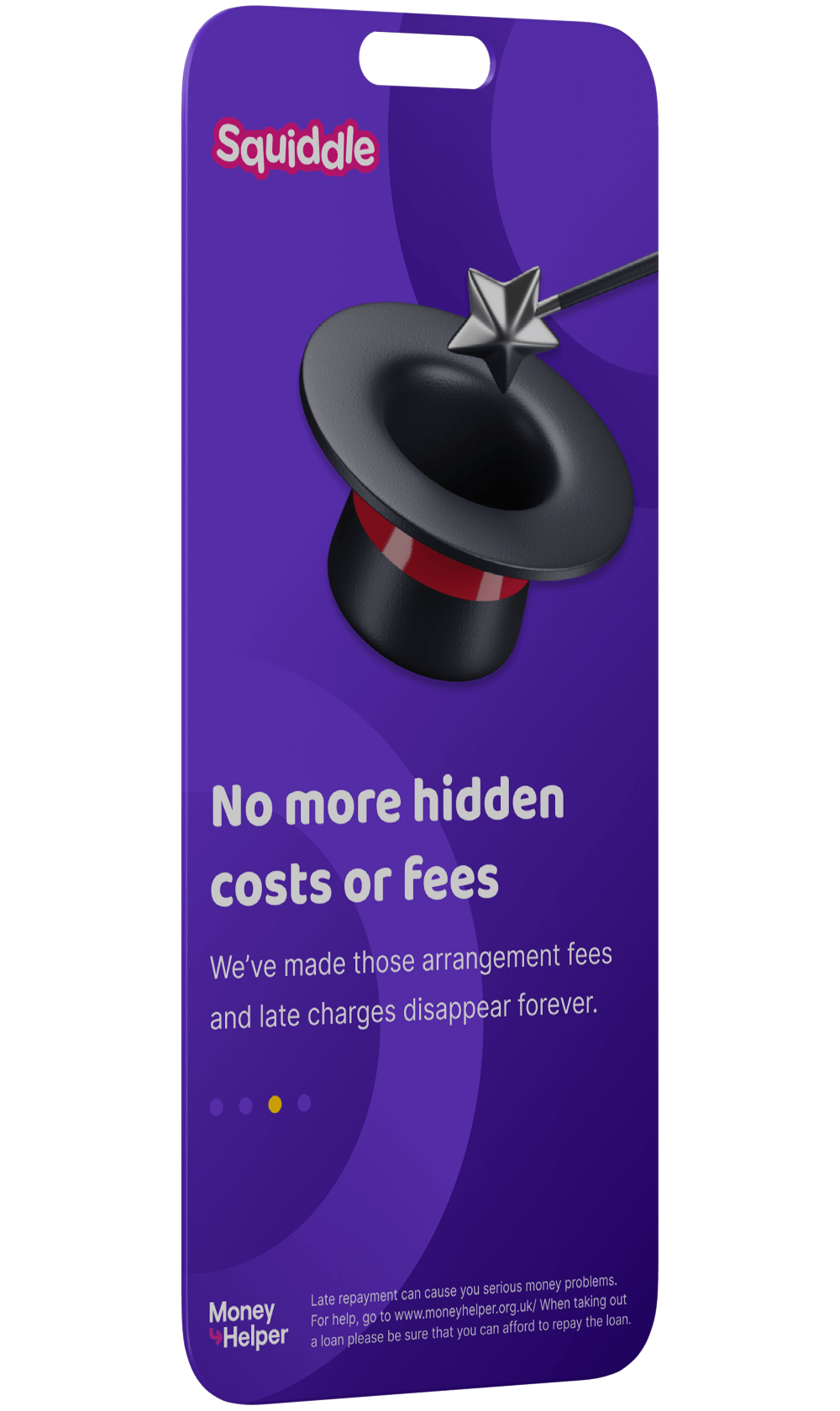
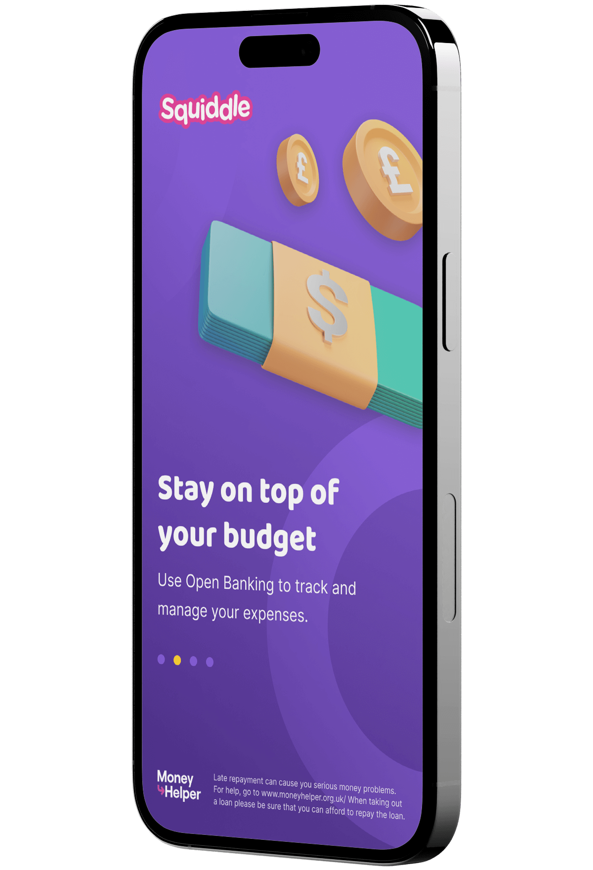
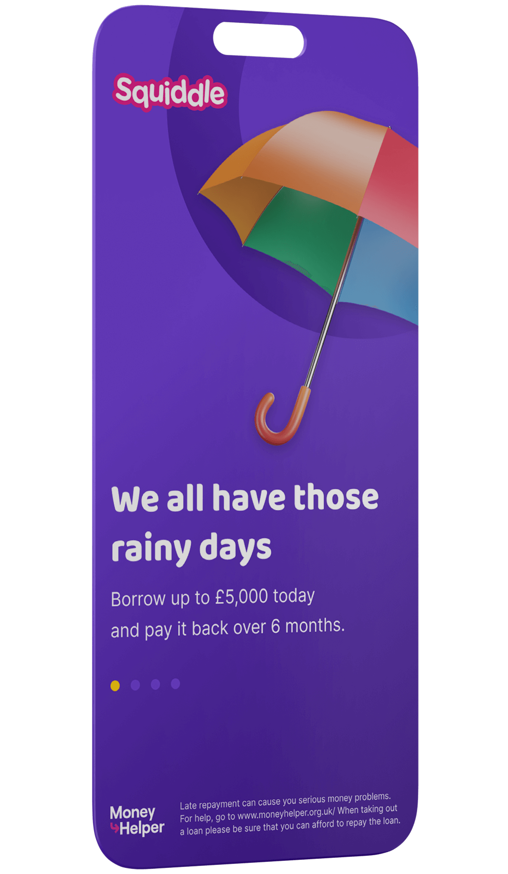
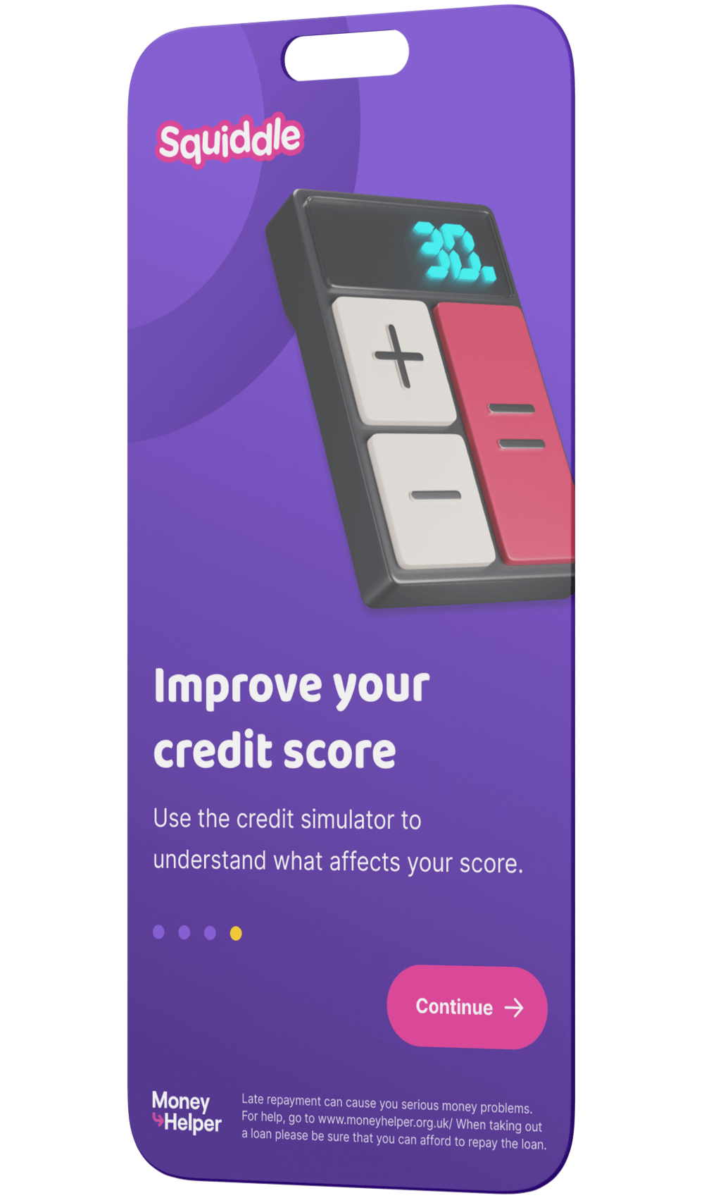
Mobile App
Given the scale of the mobile experience, we collaborated with an external agency to develop the app’s UX and UI. Acting as design leads on the client side, we provided strategic oversight, ensuring their work aligned with the direction established for the website and the design system.
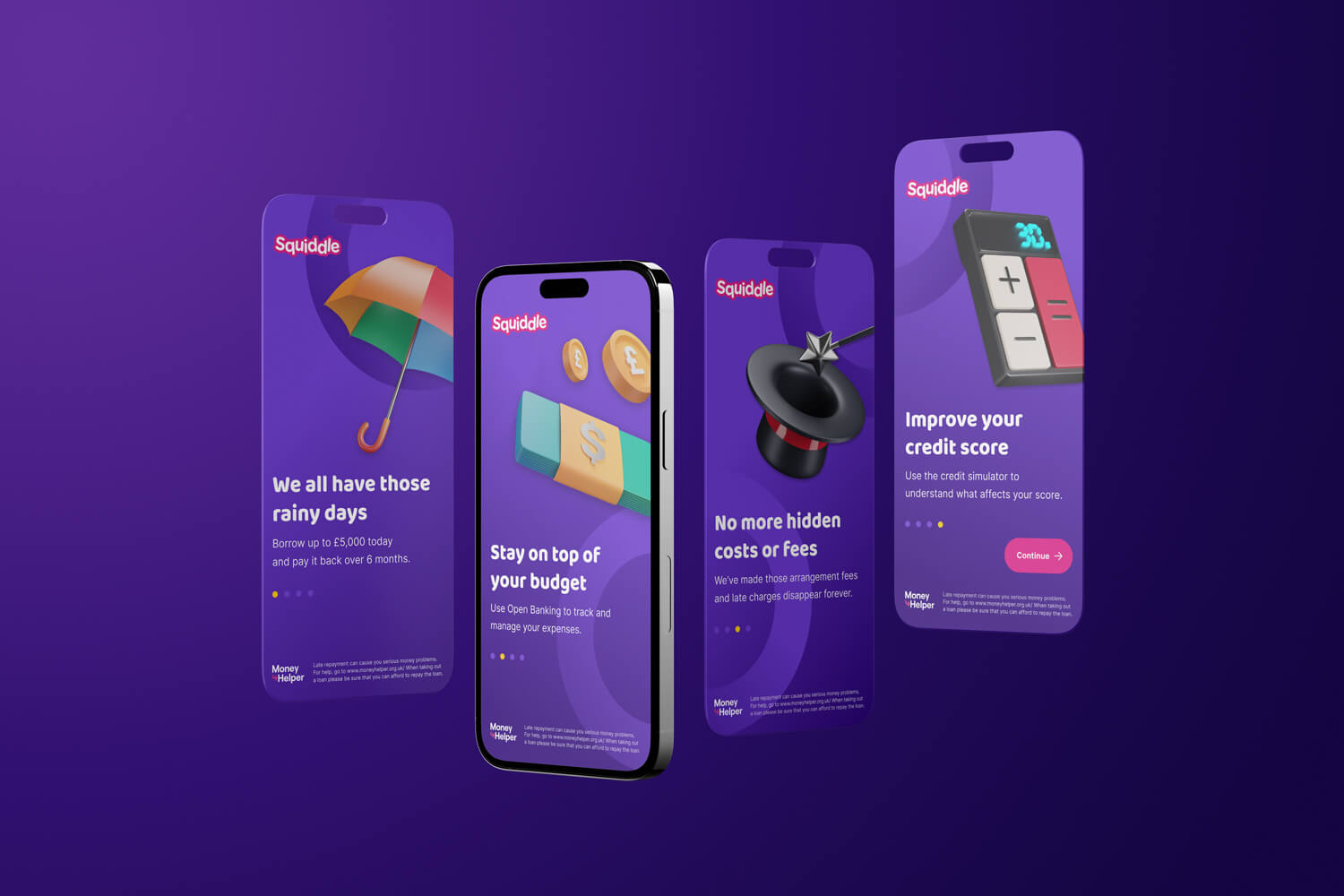
Regular workshops and design reviews helped both teams stay aligned, while sharing progress from the component library kept visual and functional consistency front of mind. A key contribution from our side was the onboarding flow, which was designed to set the tone for new users: clear, friendly, and trustworthy. This early touchpoint helped guide the agency’s approach to the rest of the app, ensuring the entire experience felt cohesive from the first screen onward.