

MiniDeed
User experience and interface overhaul, including interaction design for an ethical social media app.
My Contribution
- UX Design
- UI Design
- Interaction Design
Year
Tools Used
- Figma
- Illustrator
- After Effects
- Photoshop
A mini social platform making a big difference.
MiniDeed allows users to effortlessly crowdfund for humanitarian causes. Instead of simply “Liking” people’s posts, every time you press that ❤️ button you actually donate 1p to a registered charity. All the pennies add up and help bring about real change.
Initially, I set off to create a few screens as to what I would imagine the interface could look like, but slowly the project evolved into a full rethink of the user experience, redesigning the interface of the entire app including interaction design. This was a self-initiated project I did during the 2020 lockdown.
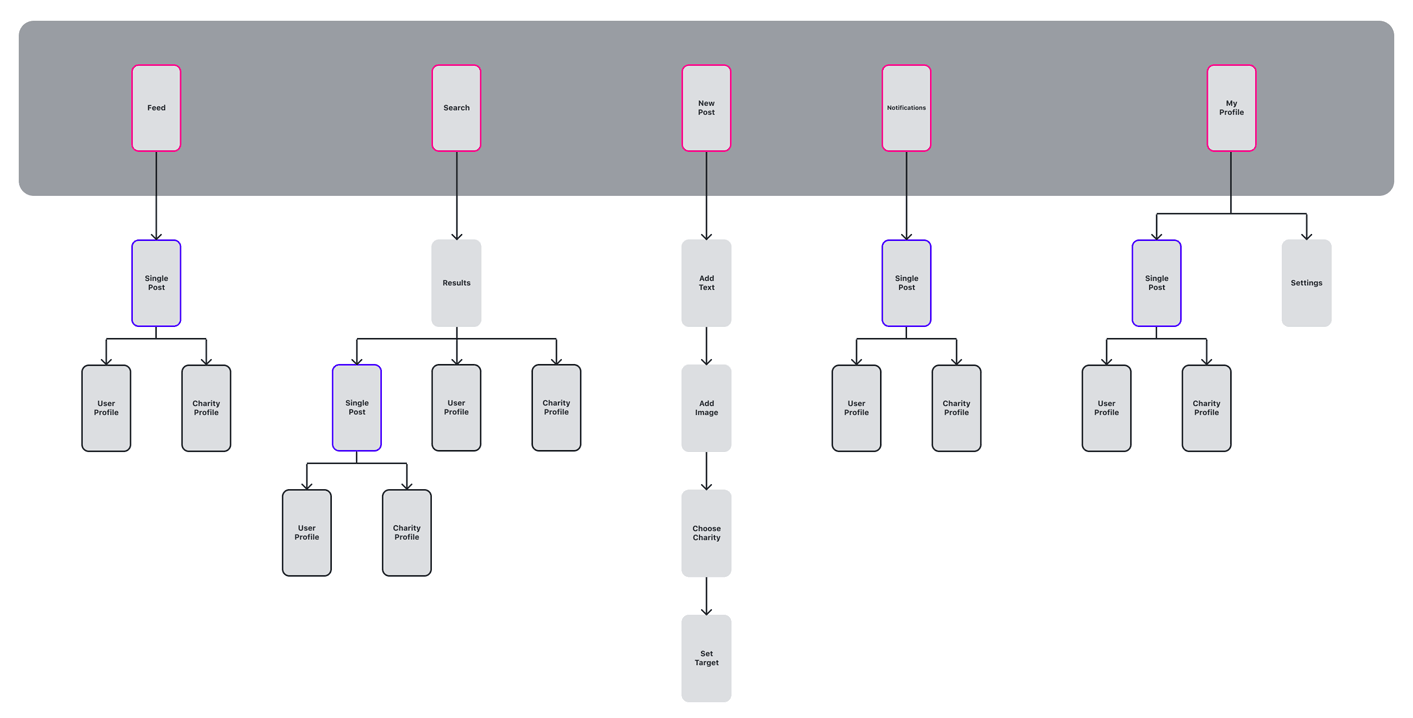
Simplified Sitemap
I was immediately drawn to the concept of the app, a social media platform that empowers users to contribute to humanitarian causes through their interactions. While the idea was inspiring, the interface and overall user experience felt disjointed and overly complex. The app contained too many screens and interaction layers, which not only created unnecessary friction for users but also introduced more potential failure points within the product.
To tackle this, I decided to go back to the foundation of the design by reconstructing the sitemap. My goal was to simplify the app’s structure so that every screen served a clear purpose in the user journey. I carefully reviewed the existing flows, identifying where features overlapped or where additional steps did not add value. For example, the fullscreen image view was redundant as users could already view images within posts, so a separate screen only added clutter and extra work for the engineers without enhancing the experience.
By eliminating these unnecessary touchpoints, I was able to create a more focused and intuitive sitemap. This streamlined approach not only reduced cognitive load for users, making the app easier to navigate, but also allowed me to concentrate my design effort on the most meaningful interactions. Additionally, reducing the number of screens improved the app’s overall stability by limiting the number of elements that could break, lag, or confuse users.
In the end, this restructuring exercise wasn’t just about decluttering the interface, it was about creating a cleaner, more intentional design foundation that could better support the app’s powerful mission and future growth.

Intuitive Interface
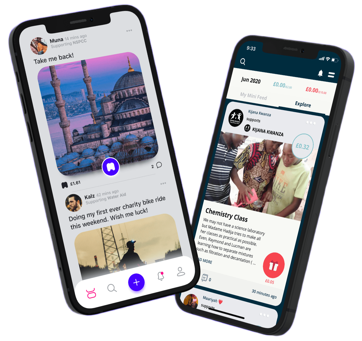
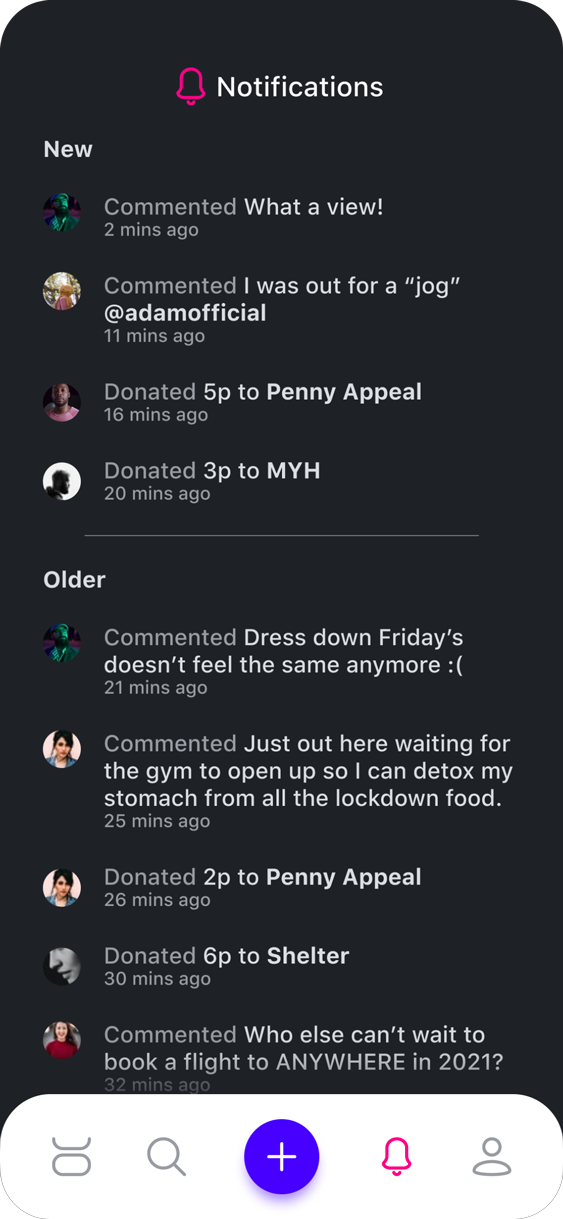
In the original app, navigation was handled through a hamburger menu, which required users to take additional steps to reach key sections. This not only slowed down navigation but also buried core features that should have been more easily accessible. To improve usability, I introduced a bottom navigation dock, a familiar pattern across popular social media platforms that provides quick, one-tap access to the most important areas of the app.
I deliberately chose a layout that aligned with established user expectations. By following a widely adopted convention, I could reduce the learning curve and make the transition into the redesigned experience feel more intuitive and natural. The dock consists of five primary buttons: Feed, Search, New Post, Notifications, and Profile. These were selected as the essential pillars of the platform, ensuring users could move seamlessly between discovery, content creation, and engagement.
A particular focus was placed on the New Post button, which I highlighted visually to encourage content creation. This decision was not only about guiding user behaviour but also about driving platform growth. More posts lead to increased engagement, as users receive notifications and interactions on their contributions. In this way, the navigation design directly supports the app’s core objective of building an active, socially driven community around humanitarian causes.
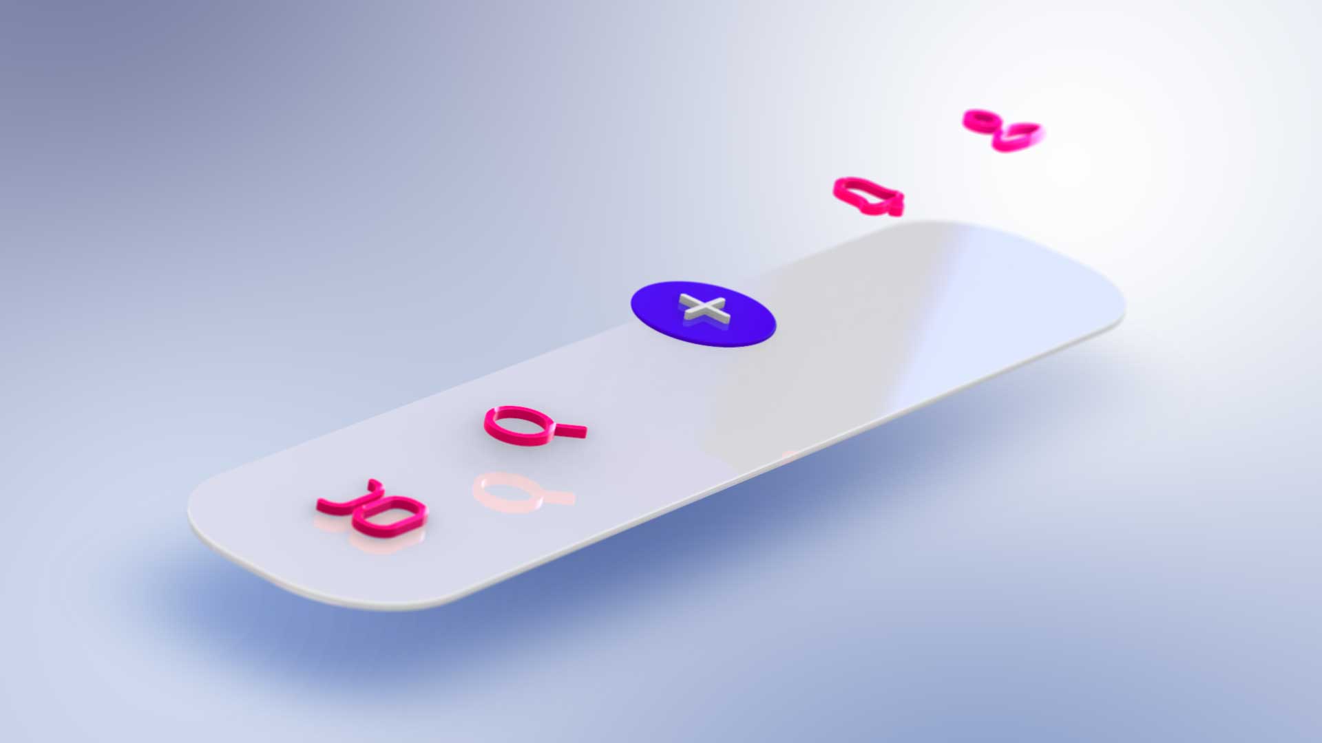
To bring harmony across the interface, I designed a custom set of icons using a 24 column grid.
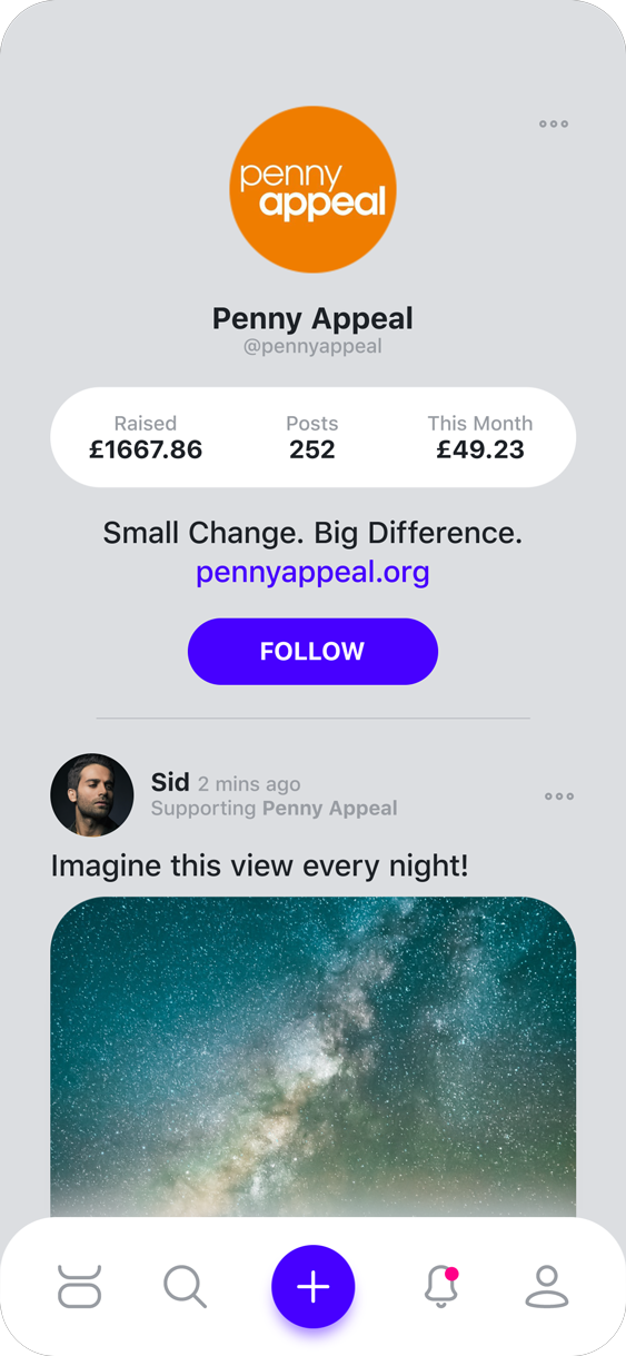
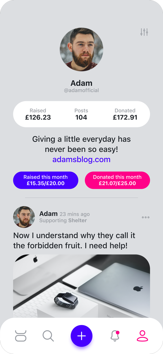
Powerful Profiles
Fostering a sense of belonging and recognition is crucial to the success of any social media platform, and the profile page plays a key role in achieving this. It provides users with a personal space to reflect their activity and contributions while reinforcing their presence within the community. Consistent with the rest of the app, I focused on keeping the interface clean and purposeful, displaying only the information that adds value to the user experience.
For their own profile, users can view monthly fundraising and donation targets they’ve set for themselves, offering a clear way to track progress and celebrate achievements. Recognising that some of this information may be personal, I designed the interface to adapt based on context: when viewing another user’s or charity’s profile, the targets are replaced with a simple follow button. This ensures privacy while maintaining an intuitive and consistent navigation experience, helping users engage with others in a meaningful and respectful way.
Designed To Delight
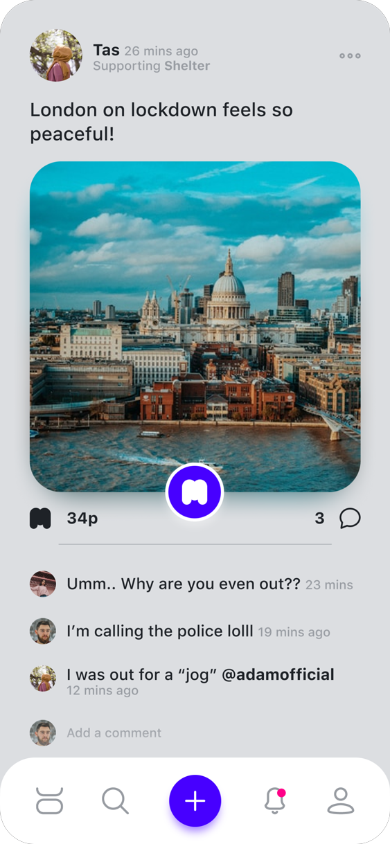
The donation feature is the defining element that sets MiniDeed apart from traditional social media platforms. Unlike other networks where engagement is measured by likes or shares, the success of this app relies on users actively choosing to donate. This made the design of the donation interaction a critical focal point. I wanted to ensure that tapping the donate button felt intuitive, rewarding, and enjoyable, so that users would be encouraged to engage with it frequently. After exploring and testing several different placement and interaction options, I landed on a solution that balanced visibility, accessibility, and delight.
Accessibility and ease of use were central to this decision. I placed the donate button prominently in the bottom center of each post, a position that is ergonomically comfortable for both left and right handed users. This reduces effort for the user while keeping the feature immediately visible and within reach.
To draw attention without overwhelming the content, the button was designed in a bright accent colour and allowed to subtly overlap the photo. This creates a sense of prominence and priority, making the call to action feel central to the post experience rather than secondary.
The most distinctive aspect of the feature, however, lies in its microinteractions. Instead of a static confirmation, each tap of the donate button triggers a brief animation: the button shifts colour while mini hearts and particles float upward in a reverse confetti effect. This celebratory visual feedback transforms what could have been a transactional action into a moment of delight, reinforcing the emotional satisfaction of giving. By rewarding users with an engaging interaction, the design encourages repeated use and helps strengthen the app’s overall mission of making acts of generosity feel joyful and effortless.
Focussed
Clean and minimal layout helps draw attention to the content.
Effortless
A familiar layout to other popular apps for ease of use.
Accessibility
Neutral colours on the interface causes less strain on the eyes.
Tap Friendly
Bright donation button to encourage the user to tap on it.
Reflections & Retrospect
What began as a small redesign exercise quickly evolved into a much larger undertaking. Taking on the entire project alone within just a few weeks was certainly ambitious, but it provided me with a valuable opportunity to immerse myself in the end-to-end product design process. I approached this as a self-initiated challenge during lockdown, with the goal of sharpening my skills and exploring how an existing product could be reimagined to improve on it’s UI/UX.
If I were to revisit this project with more time and resources, I would place greater emphasis on developing detailed user personas and conducting usability testing. This would allow me to validate assumptions, gather meaningful feedback, and better measure how effectively the redesign addresses user needs.
Overall, this project was both demanding and rewarding. It allowed me to stretch across multiple facets of design, ranging from information architecture and interaction design to visual design and product strategy. Most importantly, it reinforced my belief in the power of design to simplify complex experiences and to inspire positive user engagement.